Most ticketing marketplaces are noisy. Banner ads compete for the eye, sponsored cards push your event down the page, retargeting pixels chase your fans across the internet, and the platform brand demands more visual real estate than the show itself. Hoizr was built against this. The consumer marketplace at hoizr.com runs no banner ads, no sponsored placement, no third-party pixels — by design. Every pixel that isn't yours is either functional or removed.
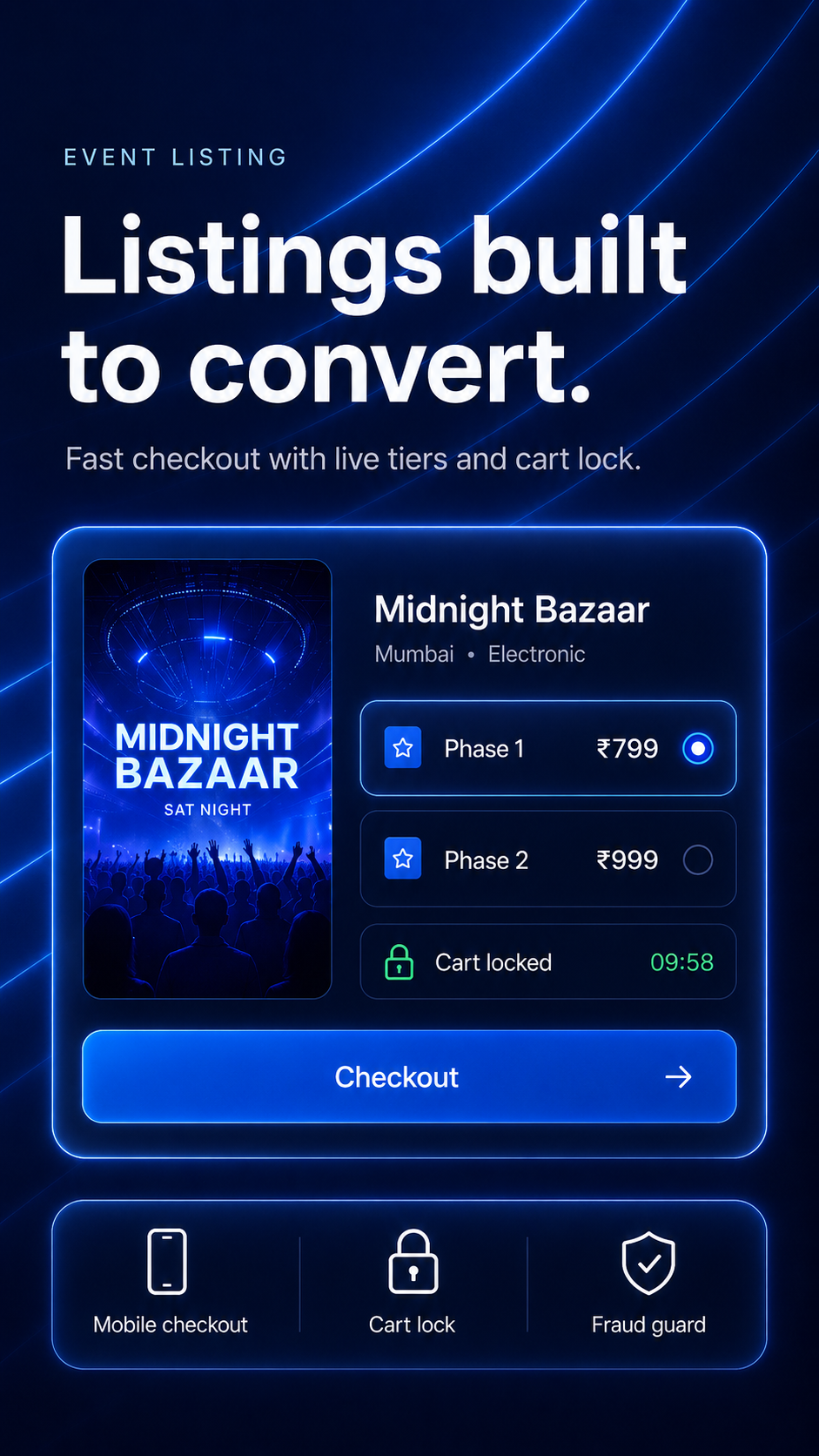
The visual system is engineered around the flyer. Cover art surfaces at the aspect and scale fans actually read; the page typography sits in a deliberate hierarchy so the lineup, venue, and ticket ladder read in the same order a buyer naturally considers them. The result is a listing that feels less like a marketplace cell and more like a microsite — without the cost or work of building one.
The checkout flow is shaped by behavioral science as much as engineering. Decision points are short, payment options are India-first, the cart lock removes the 'will tickets disappear' panic, and confirmation lands on the device a fan will actually scan with. The whole flow is sequenced to match how the buyer is already thinking — pick the night, confirm the tier, pay, done — rather than what would be operationally convenient for us.
Underneath the marketplace surface, the platform also auto-tunes the SEO, schema, and share previews so the event ranks and travels well in WhatsApp, Instagram, and search. You don't write any of it. Hoizr handles the technical layer, and you focus on the show. The listing module and the marketplace it lives in are not two products — they are one engineered surface, and every choice in it is in service of one outcome: more of the right fans converting on the first visit.